The Botanist
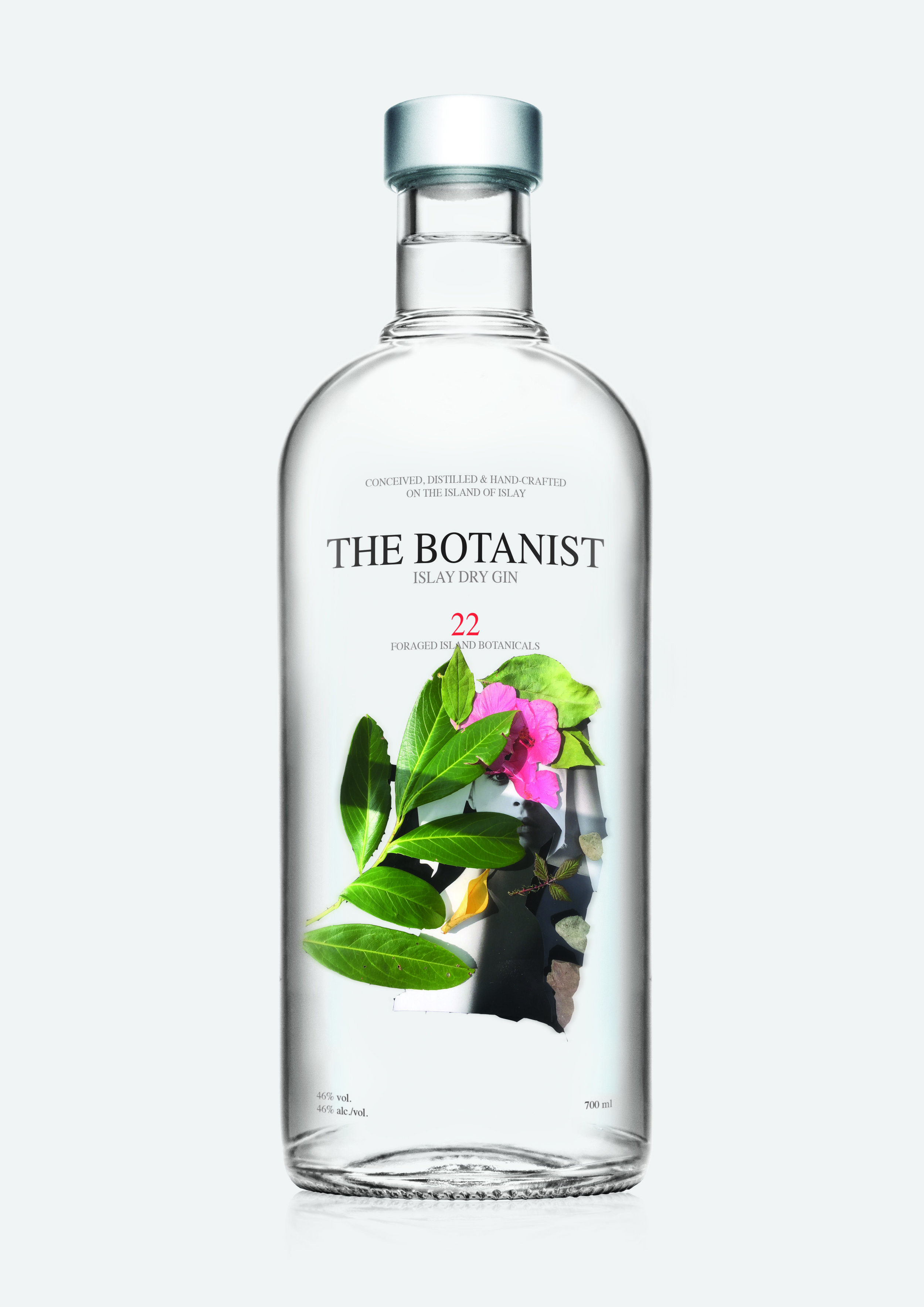
This is an University assignment brief. The Botanist brand has asked me to create 3 new label designs for their new product line of 3 new flavored gin bottles. I have also been asked to create coasters, website and poster for the new products. The theme of it is “Symbiosis” and I have shown that thru my visual artwork by using collage technique. Gin is made out of strong alcohol mixed with botanicals which is another form of symbiosis. There is a relationship there. I wanted to metaphorically portray that by using strong animal like a lion and strong images of nature like rocks, forest and mix that with soft flower images.
MESSAGE
My design work speaks about relationship between humans, nature, plants and animals. The visual interpretation is up to the viewer to understand. It could be the botanist being in the wild nature and their adventurous life. My aim was for the target audience anyone under age of 35 years being able to identify with the visuals and think of themselves as the wild animals at heart who live in this world full of beautiful nature. The Botanist brand encourages clients to be more adventurous and wild and my design work will continue their brand’s message.
Example of my Design process
I used images cut out from magazines and made a collage on a table. I used rocks, flowers, leaves - anything I could find and played around with different ideas. I photographed the collage images and used those photographs in my design work.
Here is an example of a fun collage idea that did not end up in my final product design.
I collected moss, branches, flowers and plants from forest and created a collage out of it, also using pictures cut out from magazines.
LABEL DESIGN
MESSAGE
The design work speaks for itself. Thanks to the clear bottle design, the artwork is in focus and the logo for the Brand stands proudly above it and makes the brand’s image be attractive and creative. The realistic yet mysterious design adds surprising touch.
COASTER DESIGN
RAPTURE PASSION FUSION
WEB DESIGN
The website talks about being ‘wild’ and ‘picking your adventure’ and the bright graphics speak about that message thru the artwork. The landing page is professionally made to appeal to young adults 21-35 year old’s generation. The website has easy navigation which makes it user friendly and allows the client to have more enjoyable experience.
This poster will definitely catch the viewer’s eye with it’s bright colours and contemporary imagery!


